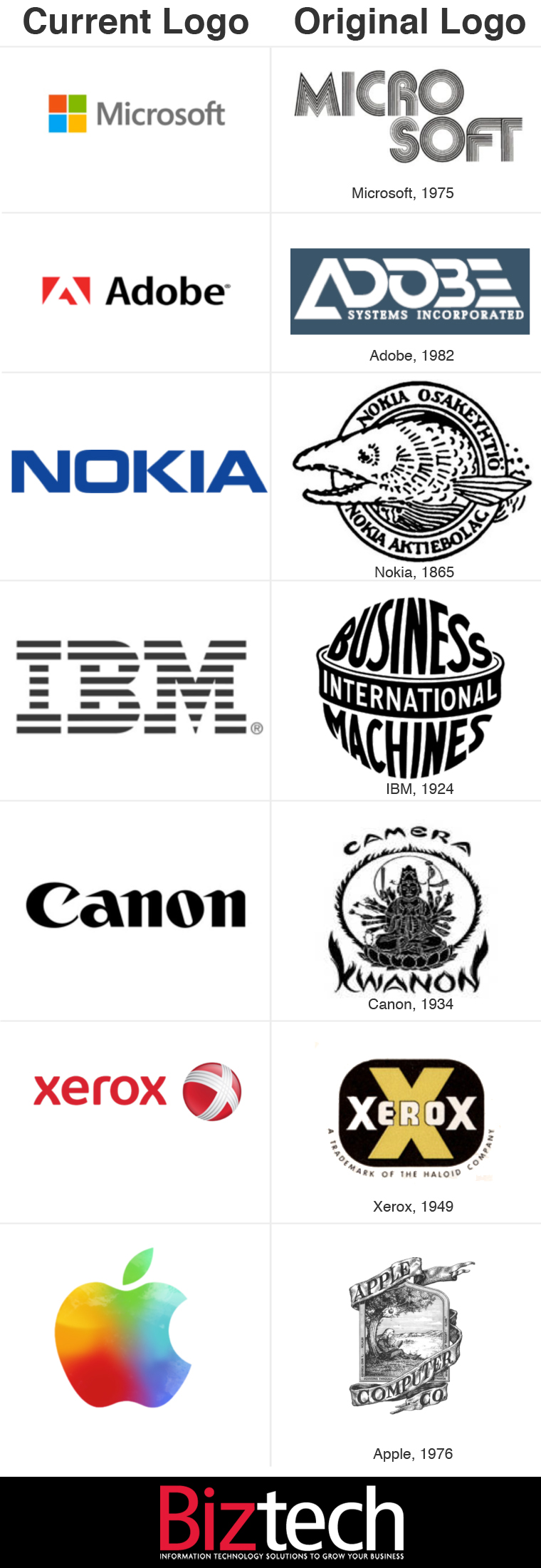
A Look Back at 7 Tech Company Branding Makeovers
One of the most iconic and customer-facing components of any company is its logo. Done right, it can evoke a sense of familiarity, ease and comfort. Done wrong, it can force a disconnect and incite negative responses from consumers.
Logo refreshes are often met with loud, opinionated reactions. Microsoft’s recent decision to update not only its Windows logo but also its corporate Microsoft logo generated plenty of feedback across the Web. The intense responses were perhaps unavoidable, since it was the first time that the company had changed its corporate logo in 25 years.
As Microsoft prepares to launch new or updated versions of just about all of its products the company’s choice in logo shows that they are looking to streamline their brand.
Microsoft’s first logo, released in 1975, was truly a sign of the times with its disco-influenced typeface. The new design is the company’s first logo to include a symbol, but it also ties in thematically with the refreshed Windows logo, which takes the same symbol, dunks it in a monotone blue and skews the perspective.
But Microsoft is certainly not the first tech company to hit the reset button on its logo. The motivations for such changes vary, but it’s safe to say that very few tech companies still bear the original logo they started out with. Like clothing, logos can fall out of fashion, and sometimes it’s necessary to update to stay modern.
Take a look at the original and current logos of seven popular technology companies to get an idea of just how far they’ve come in their branding.


